The first thing I would do on Publisher after choosing the A4 size to work on would be to select work on the Master Page. I would do this by pressing control M. Usually Master pages are used to apply features which would be applied to all pages, however I used this feature for the background and other parts I don't think I will be editing again.
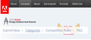
Something I am particularly proud of in my posters was when doing the Adobe one. I noticed that on their website they had displayed squares which tiled across their banner. I wanted to incorporate this in my poster somehow. I started by screen capturing their banner and cropping it just so that a plane section of the squares were shown.
I then used this to tile through the top of the document. Unfortunately due to Publishers limited tools, this proved quite an effort to tile an image at the size you wanted. So I decided to do this manually. I was very pleased with the results.


No comments:
Post a Comment