I had a tutorial with my lecturer regarding the posters.
Firstly, the logo needed to be changed as it looked like a logo that already existed. This was particularly in terms of when it came to the A and how the line crossing the A came out.
When the CommArts poster was printed, the sides of the poster was cut off. This was bad and needed to be changed.
The posters didn't show enough consistency throughout and needed to look
as though they had been made with the same style and format and thus
the same company.
These are things I will need to work on.
I also gave my idea on which competition I should enter and it was confirmed!
Monday, 21 October 2013

Friday, 18 October 2013
Planning: Deciding which Competition to Enter
By designing the posters, it really helps to find the deliverables. I've gone through all three competitions and I've decided that the competition I should enter will be the Horizon advert competition.
This competition is still open for me to enter, which is really good. Not only this but in the previous years I have not created and advert before so this will be something new and fresh.
All I need to do now is decide which Advert I should create, for what company and the features of the advert, such as the size, format etc.
Since I already have an account with Google Adsense, a good place to start would be to browse which types of ads they offer and then I can follow the sizes they have available.
This competition is still open for me to enter, which is really good. Not only this but in the previous years I have not created and advert before so this will be something new and fresh.
All I need to do now is decide which Advert I should create, for what company and the features of the advert, such as the size, format etc.
Since I already have an account with Google Adsense, a good place to start would be to browse which types of ads they offer and then I can follow the sizes they have available.
Sunday, 13 October 2013
Working Processes: Creating the Posters
I've decided it's best to create the posters in Publisher as it's a software which is meant for creating posters. There are other software's available such as Illustrator but I do not have access to them outside of the University. Plus Publisher is a Software I'm very comfortable with and have been using for a good amount of time.
The first thing I would do on Publisher after choosing the A4 size to work on would be to select work on the Master Page. I would do this by pressing control M. Usually Master pages are used to apply features which would be applied to all pages, however I used this feature for the background and other parts I don't think I will be editing again.

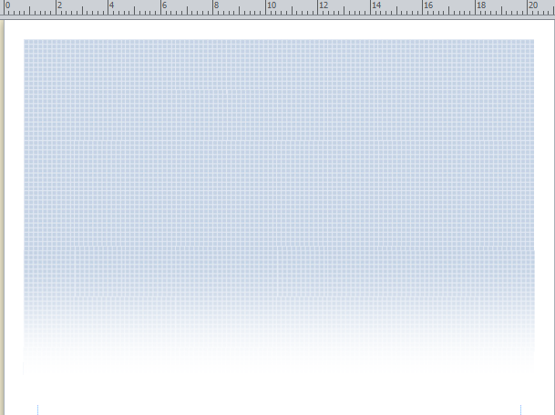
Something I am particularly proud of in my posters was when doing the Adobe one. I noticed that on their website they had displayed squares which tiled across their banner. I wanted to incorporate this in my poster somehow. I started by screen capturing their banner and cropping it just so that a plane section of the squares were shown.
The first thing I would do on Publisher after choosing the A4 size to work on would be to select work on the Master Page. I would do this by pressing control M. Usually Master pages are used to apply features which would be applied to all pages, however I used this feature for the background and other parts I don't think I will be editing again.

Something I am particularly proud of in my posters was when doing the Adobe one. I noticed that on their website they had displayed squares which tiled across their banner. I wanted to incorporate this in my poster somehow. I started by screen capturing their banner and cropping it just so that a plane section of the squares were shown.

I then used this to tile through the top of the document. Unfortunately due to Publishers limited tools, this proved quite an effort to tile an image at the size you wanted. So I decided to do this manually. I was very pleased with the results.


Subscribe to:
Posts (Atom)